
How to Craft High-Converting Landing Pages
A landing page is a single-purpose webpage designed to get one result. That might be a lead, a sign-up, or a sale. It’s focused, distraction-free, and built to guide the visitor toward taking action.
Unlike a homepage, a landing page speaks to one audience with one goal. That’s why it converts better than most other pages on your site.
In this guide, we’ll explain what a landing page is and what it isn’t, how to design one that works, and which mistakes to avoid if you want better results.
Sounds good? Read on to find out how to make your landing pages do their job.
What is a Landing Page and Why It’s Different
A landing page is a single-purpose webpage built for a specific marketing purpose. That might mean guiding the visitors to sign up, make a purchase, or drop their email in a form. Unlike your homepage, which introduces your whole site, a landing page skips the small talk and gets straight to the point.
Website landing pages are different from a homepage because they don’t offer distractions. No links to other services or anything like that. Just a clear headline, focused content, and a call to action. That’s what separates good landing pages from ones that flop.

Say you’re promoting a new product. Instead of linking to your homepage, you send people to a targeted landing page that sells the product. Our findings show that this focused approach leads to higher conversion.
And that’s why the best landing pages tend to outperform everything else.
What is Lead Generation and How Landing Pages Help
Lead generation in marketing means getting people who are interested in what you offer to share their information. This could be a name, email address, or phone number. Once you’ve got that, you can build a relationship that might eventually lead to a sale.
A specific landing page can sharpen your message and speak directly to one need. That makes good landing pages an inevitable part of any lead generation strategy.
Here’s why landing pages work so well for getting leads:
- Landing pages offer a single clear choice instead of a list of options.
- They provide something valuable in return for information.
- What someone is already searching for (a fix, an answer, or a shortcut) is matched in a landing page.
Now let’s look at how you can take this even further by focusing on the right kind of leads.
How to Do Strategic Lead Generation
Strategic lead generation means focusing on the right kind of people, the ones who are more likely to become paying customers. Instead of chasing numbers, you’re aiming for fit. That makes your time, tools, and follow-ups more effective.
Here’s how to start strategic lead generation:
- Define Your Ideal Customer: Know who you’re targeting by digging into their demographics, behaviours, and challenges. This lets you speak directly to what matters to them. Use lead generation software, like Google Analytics, to spot patterns in who’s already converting.
- Create Valuable Content: Build resources that your audience is already searching for, like guides, video walkthroughs, or bite-sized webinars. Engagement goes up when your landing page content mirrors what people are searching for.
- Utilise Multiple Channels: You can share your offers on platforms (e.g., LinkedIn, email, or organic search) where your audience spends time. Make sure every touchpoint leads back to your landing page with one clear call to action. Your conversion rate optimisation strategy will fall flat if no one sees your content.
- Implement Lead Scoring: Not all leads are created equal. Assign scores based on actions they’ve taken and how well they match your ideal client profile. For example, someone who clicks a pricing page and downloads a guide ranks higher than a casual browser. Lead gen tools like HubSpot or ActiveCampaign can automate this scoring process.
Pro Tip: Add a qualifying question to your forms. Asking about company size, budget, or role can help you filter fast. Your sales team will thank you.
With your form doing its job, it’s time to tighten up the whole page. Let’s talk about design choices that support conversions.
How to Design a Landing Page That Converts
A good landing page helps visitors take one clear action. When someone lands on your page, you’ve got seconds to grab their attention. The layout, wording, and visuals all play a role in helping them decide if it’s worth engaging. That decision gets easier when everything on the page points in the same direction.
Here’s how to build website landing pages that convert:
- Write a clear and specific headline: Your headline should immediately explain what the page offers. Make it benefit-focused. A good example might be “Get Your Free Marketing Checklist in Under 30 Seconds.” It’s short, useful, and tells the visitor exactly what they’ll get.
- Use a strong and visible call-to-action button: Your CTA should be bold, simple, and obvious. Action words like “Get Started” or “Claim My Spot” work well. Place it in a spot people see right away, like near the top of the page.
- Add useful visuals: Images help people understand your offer faster than words. A screenshot, a short video, or even a clean product photo can help explain what you’re offering. People process visuals faster than text, so adding images can boost conversion.
- Make the page mobile-friendly: Most traffic today comes from phones. Your layout needs to adjust to any screen. Test it across different devices and keep load times fast for better SEO and conversion optimisation strategy.
- Build trust with real feedback: Add social proof like testimonials, logos of past clients, or third-party badges. Showing even a handful of positive experiences can dramatically lift trust and improve conversion optimization. Visitors are more likely to act when they feel your page is safe and reliable.
- Remove distractions: Take out menus, pop-ups, or sidebars. The fewer options, the higher the chances someone will convert. We often recommend using free landing page templates as a starting point, as they are already built with fewer options.

One of our clients had a beautiful landing page, but conversions were low. After we simplified the headline, shortened the copy, and moved the CTA higher, the conversion rate doubled in just two weeks. It showed how small layout changes can make a big difference.
Ever felt like your landing pages “look fine” but still underperform? The issue might be what’s getting in the way. Let’s break down the most common mistakes so you know what to avoid next.
Common Landing Page Mistakes to Avoid
If your landing page isn’t converting, it doesn’t always mean your offer is bad. It could be the way the page is built. Even a good-looking landing page can underperform if it includes common mistakes. These issues can reduce conversions, often without you noticing.
Knowing what to watch out for makes it easier to fix problems before they cost you results. Watch out for these common mistakes on your landing page:
- Too many calls to action: A landing page works best when it guides visitors to take just one specific action. Using clear CTAs is the best way to increase your conversion rate.
- A headline that doesn’t match the offer: If the message in your ad or email doesn’t line up with the landing page, people will bounce. So to avoid that, make sure your headline mirrors the offer and stays consistent throughout. Users will quickly understand what you’re offering and maybe even share it with others. In turn, you build trust and boost your chances of conversion.
- No trust signals: If a visitor isn’t sure your offer is real or safe, they will hesitate to act. To combat this, you can add logos of trusted brands, short reviews, or privacy notes. These small things are the indicators that say your site is trustworthy. And, when your landing page seems reliable, your visitors feel secure.
- Slow load time: According to Think With Google, most people won’t wait more than 3 seconds. You’ll lose visitors before they even see your headline. Use image compression tools, reduce third-party scripts, and consider a speed-boosting plugin. A faster loading time is especially important for mobile landing pages, where load speed can make or break performance.
Small changes in design and wording can fix most of these problems. Use this checklist before building a new page or updating an old one. It’s one of the easiest ways to improve results without starting from scratch.
So, how do you know your changes are working, and how do you keep improving? That’s where using conversion rate optimization works best.
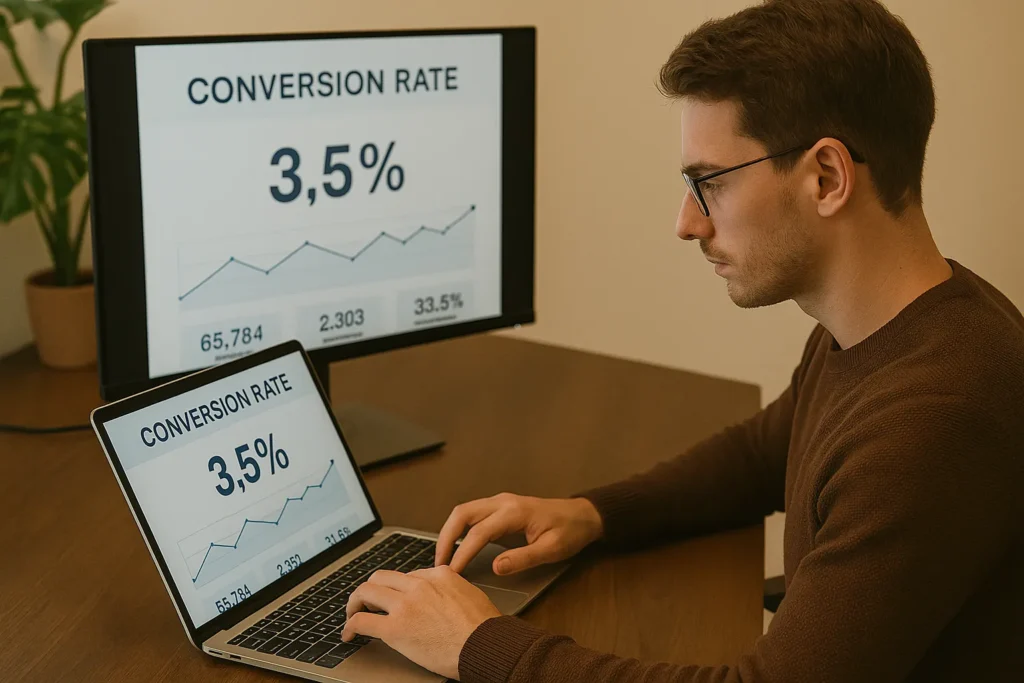
What is Conversion Rate Optimization and Why It Works
CRO or Conversion Rate Optimization means making your website better at turning visitors into leads or customers. Instead of guessing what works, CRO helps you test elements like headlines, button text, layouts, and measure what real users respond to.
With tools like heatmaps, session replays, and A/B testing, you can see how people interact with your landing page. This removes the guesswork and gives you a clear picture of where users click, scroll, or drop off. You’re actively improving conversion rates with data.
A study by the University of Texas notes that average conversion rates range between 2%-4%. But with strong conversion optimization, that number can jump significantly. We’ve seen clients double lead volume just by changing their call-to-action placement and simplifying their forms.
CRO works because it’s grounded in real user behavior. You’re not redesigning for design’s sake. You’re tweaking to increase your landing page conversion rate without needing more traffic.
If you’re ready to stop guessing and start growing smarter, the next step is to measure the results of your landing pages. Let’s look at how to do that.
How to Calculate Conversion Rate with Tools
Knowing your conversion rate helps you measure how well your landing page is turning visitors into leads. It’s one of the most important lead generation metrics because it tells you if your page is doing its job. Without calculating your conversion rate, you’re flying blind.
Track the numbers, and you’ll know if your changes are helping or hurting and where to focus next.
Here’s the basic formula for calculating conversion rate:
- (Conversions ÷ Visitors) × 100 = Conversion Rate
Let’s say 25 people sign up out of 500 visitors. That’s a 5% rate (plenty of room to grow). Even small percentage increases can lead to dozens or hundreds more leads over time. And if your traffic is already solid, improving conversion rate is the fastest path to more outcomes without spending more.
Helpful tools to get you started:
- Google Analytics: Use Goal Tracking from Google Analytics to measure actions like form submissions or button clicks. You can also set up funnels to see where visitors drop off. This helps you spot where your landing page might be losing people.
- Hotjar: See where users are getting stuck by using visual tools like heatmaps, scroll maps, and feedback polls. Hotjar shows you what people are doing on your page, so you can fix problems before they cost you leads.
- Plausible Analytics: Plausible Analytics is a privacy-friendly alternative to Google Analytics. It still gives you solid insights into what’s working, like tracking goals, button clicks, and traffic sources. Also, it doesn’t use cookies, which makes it great for privacy-focused teams.
Pro Tip: Before you make any changes, write down your current conversion rate. That way, you’ll know what’s working and can measure real progress.
Ready to turn data into action? Next, we’ll walk through the smart, strategic tweaks that can boost your landing page performance without starting from scratch.
Smart Tweaks That Help You Capture More Leads
Landing pages don’t need to be complex, but they do need to be sharp. A few thoughtful changes can seriously improve how many visitors turn into leads. We’ve seen clients double their sign-ups by shifting the layout and trimming extra text.
Here’s what we’ve seen work:
- Create urgency: A timer, a “limited spots” note, or an expiring offer gives people a reason to act right away. It creates momentum and nudges them to decide sooner. Just don’t fake it. If it’s urgent, it has to be real. Real deadlines lead to real decisions.
- Make the offer obvious: If someone has to scroll or read twice to understand what they’re getting, that’s a problem. The headline and short intro should spell it out clearly. Visitors should see the value in seconds. Try reading it out loud. If it sounds unclear, simplify it. You want them to nod, not squint.
- Keep distractions low: When too many things compete for attention, the main message gets lost. Cut out extra links, remove extra buttons, and make sure everything on the page supports one goal. Simpler pages convert better.
Pro Tip: Try changing your button text. Words like “Get the Guide” or “Start Free” often work better than generic options.
If you’re already getting clicks, it’s time to turn those into real customers.
Turn More Clicks Into Customers, Starting Today
You’ve now got the pieces in place, a clear value offer, a well-built landing page, and smart ways to attract and convert high-quality leads.
If your current pages aren’t performing well, don’t keep guessing. Use what you’ve learned here to do a quick audit. Fix what’s confusing, cut what’s not helping, and always keep your user in mind.
Need help making your site convert? At Website Traffic Increaser Guy, we build landing pages that look good and work hard. We combine user data, SEO strategy, and sharp copy to turn clicks into leads and loyal customers.
Let’s build a high-converting page together. Your future customers are already searching. Let’s help them find you.
Leave a Reply